Data Sculpture: Media Perspective

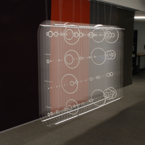
For those of us who work with data, we get used to visualizing in our mind and develop an intuition for it. For everyone else, data visualization usually takes the form of a diagram on a small, two-dimensional screen. Standard data plots can take an exciting idea and turn it into something boring, or even worse, drudge up memories of panicked high school math exams. This experimental data sculpture attempts to draw the viewer into the visualization and connect them with the data on an intuitive, physical level. The sculpture shows the amount of coverage the U.S. mainstream media gave to Net Neutrality between January 2014 and April 2015, while the FCC was creating revised Net Neutrality rules. Each of the 33 panes of clear acrylic represents a two-week time slice, with the size of an etched circle corresponding to the amount of coverage. The top row shows total Net Neutrality coverage, with the other three rows representing coverage of "innovation," "discrimination," and "regulation," in reference to Net Neutrality.
Attention peaks four times: when the FCC announces its proposal, at the end of the public comment period, after President Obama announces support for reclassifying broadband, and finally when the FCC releases its new regulations. Coverage is notably low during the public comment period, the primary time individual citizens had a chance to influence the policy. The visualization also shows that "discrimination," language used in earlier technical and legal discussion of Net Neutrality disappeared from mainstream media coverage, giving way to the more idealogical and economic terms "innovation" and "regulation." The viewer can explore these data by walking around the sculpture, standing back, or standing close, making it easy to engage without a digital interface or specialized knowledge.
Cross-posted to MIT Center for Civic Media
xsection.js | 30 Years in Data

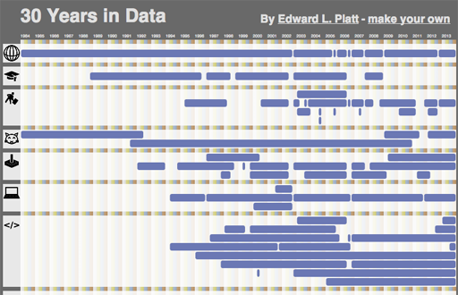
The Earth has, just today, completed revolving around the sun three times for each finger on a typical human hand since the day I was born. To commemorate the occasion, I made an interactive visualization of my life. I've open-sourced the code as xsection.js and you can create your own custom version by modifying the data.js file.
