Art, Code, and Asking
As a programmer, I know that code can be beautiful. As an artist, I know that code is not art. I don’t mean to say that code is in any way less, just different. And the difference is important, particularly when it comes to asking for support.
It’s a very exciting time for artists, as many turn to crowdfunding to support themselves. Either through single-shot funding campaigns, or ongoing patronage, artists are asking their fans for direct financial support, and fans are happy to give. The Boston-based musician Amanda Palmer has led the way, raising over a million dollars on Kickstarter to produce her most recent album. She reflects on the campaign in her book, The Art of Asking. In a passage that hit particularly close to home for me, she recounts a conversation with her mother, a programmer. As a teenager, Amanda had accused her mother of not being a “real artist” and years later, her mother told her:
You know, Amanda, it always bothered me. You can’t see my art, but… I’m one of the best artists I know. It’s just… nobody could ever see the beautiful things I made. Because you couldn’t hang them in a gallery.
Amanda came to recognize the unappreciated beauty of her mother’s work, and I have no doubt it was beautiful. But art is not just about beauty.
A few years ago, I was sitting in a client’s office in San Francisco, at a tiny desk overlooking the Highway 101 onramp, listening to music and writing code. The music was beautiful, but more than that, it showed me an entirely new perspective, that somehow felt deeply familiar. And in that moment, I felt a little more connected to humanity, and a little less alone. But I was sad to realize that my work would never help anyone else feel that way. I remembered a quote from Maya Angelou:
I've learned that people will forget what you said, people will forget what you did, but people will never forget how you made them feel.
Art catches and holds people’s attention by helping them feel new things. My work as a programmer, on the other hand, was forgettable. In fact, there’s a thing in software called the principle of least surprise: the better your code is, the less people even notice it exists. For a while, the thought of being unnoticed and forgettable left me with a sense of loss.
Relief came when I realized that although my code might never touch someone directly, it can (and has) helped artists who do. Just as the artist inspires the cancer researcher, the programmer empowers the artist. While the thought put an end to my mini existential crisis, some consequences remain, and that brings us back to asking for support.
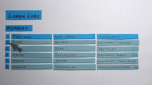
Fans like Amanda Palmer’s give because they want to. They’re grateful for the gift of art, and they want to reciprocate. Emotion is a great motivator. But what about code? Software is complex, and beautiful, and important, but it doesn’t inspire the same emotion or generosity, because you never see the beauty. You can describe the types of things software will make possible, but that can seem overly abstract. I would like to think that crowdfunding can work for software as well as art. In fact, I’m currently running a campaign for software to manage makerspaces and other cooperatives. But how can programmers create the same connection with their users that artists create with their fans?
Data Sculpture: Media Perspective
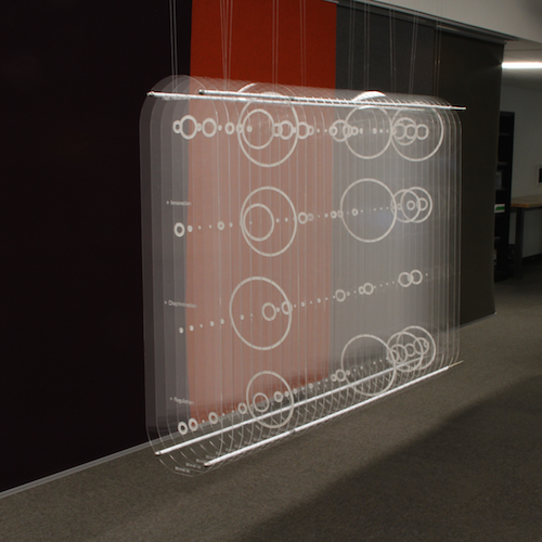
For those of us who work with data, we get used to visualizing in our mind and develop an intuition for it. For everyone else, data visualization usually takes the form of a diagram on a small, two-dimensional screen. Standard data plots can take an exciting idea and turn it into something boring, or even worse, drudge up memories of panicked high school math exams. This experimental data sculpture attempts to draw the viewer into the visualization and connect them with the data on an intuitive, physical level. The sculpture shows the amount of coverage the U.S. mainstream media gave to Net Neutrality between January 2014 and April 2015, while the FCC was creating revised Net Neutrality rules. Each of the 33 panes of clear acrylic represents a two-week time slice, with the size of an etched circle corresponding to the amount of coverage. The top row shows total Net Neutrality coverage, with the other three rows representing coverage of "innovation," "discrimination," and "regulation," in reference to Net Neutrality.
Attention peaks four times: when the FCC announces its proposal, at the end of the public comment period, after President Obama announces support for reclassifying broadband, and finally when the FCC releases its new regulations. Coverage is notably low during the public comment period, the primary time individual citizens had a chance to influence the policy. The visualization also shows that "discrimination," language used in earlier technical and legal discussion of Net Neutrality disappeared from mainstream media coverage, giving way to the more idealogical and economic terms "innovation" and "regulation." The viewer can explore these data by walking around the sculpture, standing back, or standing close, making it easy to engage without a digital interface or specialized knowledge.
Cross-posted to MIT Center for Civic Media
Mystic Rose Generator
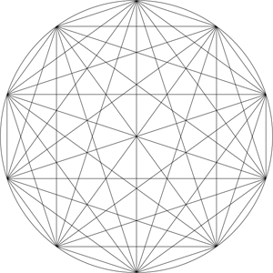
Here's yet another geometric math/art/code thing. It's a javascript-based Mystic Rose Generator. What's a mystic rose? Draw a circle with n evenly spaced points on it and draw a line connecting each point to all the others.
FlakePad
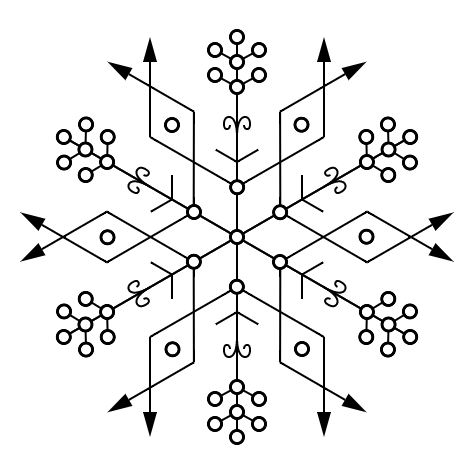
I wanted to do something interactive for Maker Faire last year. I had been drawing my PenFlakes, and thought it would be cool if people could design their own and print them out. So I created FlakePad, a javascript/HTML5 web app that enforces the basic symmetry of a snowflake, and provides a hexagonal grid to work off of.
Aside from being a great way to get my hands dirty with HTML5, the most interesting part of the app was creating the hexagonal grid. I wound up learning about and utilizing Isometric Cubic Coordinates. These coordinates provide an amazingly simple way to label hexagons on a grid, as well as a relatively simple transformation to and from standard Cartesian Coordinates. The basic trick is to recognize that a hexagonal grid, can be seen as a projection of a 3D arrangement of cubes centered on the plane x+y+z=0 (imagine Q*bert, the old NES game).
Penflakes

For one year, starting on May 5, 2011, I sat down with a pen and paper every single day and drew a black-and-white geometric design with sixfold dihedral symmetry, AKA a snowflake. The finished designs can be seen at http://penflakes.com.
I've always been fascinated by the physics and mathematics of snowflakes. Water molecules tend to line up along a hexagonal grid when they crystalize. This grid results from a combination of 1. the hydrogen bonds that hold the molecules together, 2. the angle between the two hydrogen atoms being close to the angle of a hexagon vertex, and 3. hexagons being one of the few regular polygons that tessellate. If water didn't exhibit hydrogen bonding, or if the angle of the water molecule was much different, snowflakes as we know them wouldn't exist. To me, this happy coincidence of math and physics is just as beautiful, if not more beautiful than the resulting patterns.
So when, one day in 2011, I saw an 8-sided snowflake decoration while out to lunch with some friends, I couldn't help but explain how such a design completely missed the deeper beauty of a real six-sided snowflake. With snowflakes on my mind, and as a chronic doodler (a habit rekindled in part by the amazing Doodling in Math Class videos), it was just a matter of time before I started doodling increasingly complex snowflakes. Intrigued by the possibilities, I started drawing one every day.
Snowflakes are also known for their clichéd uniqueness, which is intimately related to imperfection. This is in stark contrast to the trivially reproducible, and arbitrarily fine precision offered by the emergence of digital media. The opportunity for infinitely reproducible digital perfection certainly creates value in our lives, but it can also detract if we aren't careful. For example, sharing photos on Google+ or Facebook can add immense social value, but it can also detract if we forget the value of living in the unique, irreproducible, real-world moments those photos represent. So although it would have been easy to create perfect snowflake designs with digital vector graphics, I chose to use old fashioned pen and paper instead. Each drawing is on a piece of paper that I held in my hands, and spent about an hour drawing a pen across, influenced by whatever events happend in my life that day. I also decided to do the project for exactly one year so that each drawing represented exactly one day of the year.
As for technical details, I used a hexagonal grid generated by the Incompetech Graph Paper Generator, and took much inspiration from this book of snowflake photography by Kenneth Libbrecht.
TAD Drawing Series
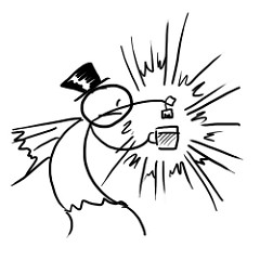
A series of drawings I did every day for a few months in 2008 and 2009. They were a ton of fun because I never knew what I was going to draw until I drew it. Full set here.
PWKW Photo Series
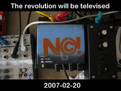
This is a photo series I did in 2007. It was meant to be a thing-a-day for the month of February, but I got off to a late start and it ran into March. At the time, I was taking a year off between undergrad and grad school, working as a freelance web developer, and soaking up the art/music culture of Detroit's Cass Corridor.
MIT Snowflake-A-Thon 2005
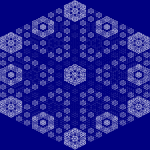
In January of 2005 I participated in the Snowflake-A-Thon hosted by the Simplicity group at the MIT Media Lab. The challenge was to write the simplest program that produced the most beautiful snowflake. You can see the gallery of all the snowflakes and a video of mine here. Update: The gallery is no longer available on the Media Lab site, but you can see my video below.
My program created a hexagonal grid, and assigned a number to each hexagon. The center started as "1" and the rest started as "0". After every time step, the value of each hexagon was added to each of its neighbors, modulo 32. I ran the code for a few time steps and then mapped the numbers to a gradient from dark blue to white. I got the idea from playing around with 2d cellular automata on a hexagonal grid when I was in high school.
I thought the resulting snowflake was really nice. Apparently the Simplicity people thought I was a total weirdo for coding a snowflake in MATLAB, but I remain pleased with the results.
