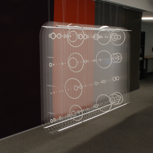
For those of us who work with data, we get used to visualizing in our mind and develop an intuition for it. For everyone else, data visualization usually takes the form of a diagram on a small, two-dimensional screen. Standard data plots can take an exciting idea and turn it into something boring, or even worse, drudge up memories of panicked high school math exams. This experimental data sculpture attempts to draw the viewer into the visualization and connect them with the data on an intuitive, physical level. The sculpture shows the amount of coverage the U.S.